
Generous Bosom 2 process report

by Conor Stechschulte
Welcome one and all to a peek behind the curtain of my process used for the creation of the newest volume of Generous Bosom from Breakdown Press. Most of what you’ll see here I developed in the making of the first volume of GB. The idea from the beginning has been to make the book in a manner that builds in layers of editing and to allow for further editing by using (mostly) the same grid. This way, I can move panels around or chop two pages in half and graft them together, things like that.
Part I: Tools

I use this fella for all the rough drawings and almost all the writing and planning as well. It’s .9 which is the biggest they come and I like to use 2B cuz that’s the softest that’s available. Originally this was because I was roughing and finishing the pages on the same piece of paper (see more on this below) and found that when I used harder lead, I pressed harder and left indentations in the paper that showed through if I tried to draw over them. Now I use it simply because I like the feel of it.

I use these pencils for all the finished final drawings. Prismacolor Ebony pencils, not to be confused with their far inferior cousin, the Strathmore Ebony pencil. I tried out a lot of different pencils at the beginning of this project (I used to live between two art supply stores) and found these to be the most versatile. I started out drawing with woodless pencils of varying hardnesses but quickly figured out that I’d drive myself crazy trying to stay consistent with what thing of what level of darkness I’d drawn with what pencil and decided to keep it simple. They’re great in that they’re the cheapest softish pencil (somewhere between $.50 and $.60) I could find and you can get a real diverse range of value out of them. I’ve gone through close to 200 of them thus far (not kidding).

All the finished drawings are on this paper. Not much to say about it. Good paper.
Part II: Planning

This is where it all started folks. I did a one-page outline and then quickly began writing out dialog as often happens. As with the previous volume, I knew what was going to happen in what order though not exactly how. Also, didn’t know at exactly which point this book would end (note the “END?” note at the bottom of the left-hand page) when I first began planning. Some notes have been redacted to avoid “showing my hand” too much.

After the overall outline is in place, I generally work in chronological order in about 10-15 page chunks. I write out the dialog (see above) and determine the page turns and then break down the panels from there. I focus a lot on timing in this project overall so I try to time each page turn with some sort of question or reveal to make the reading compelling (I hope) on a page-to-page basis.

Then I thumbnail out the pages themselves. I usually don’t put more than one page of the comic on a page in the plan book like in the image above but when the pages have color separations I have to plan them a couple times just to wrap my brain around everything that’s going on. My whole process, I’ve come to realize, has grown up around my only having to make a limited number of decisions at any given stage.
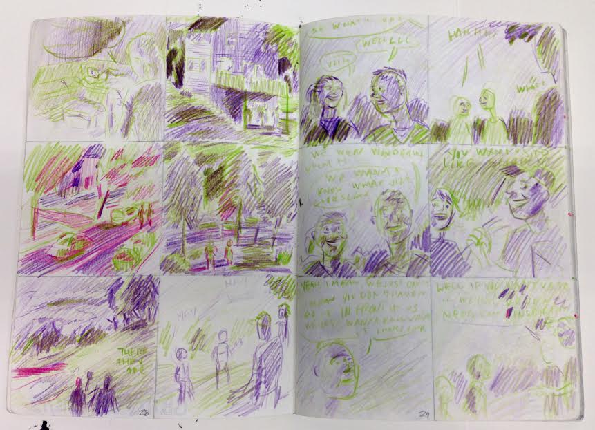

I broke down what I was going to draw in the thumbnails above so I only had to decide what was going to be what color when I made the second round of plans for these pages.
Part III: Roughing It

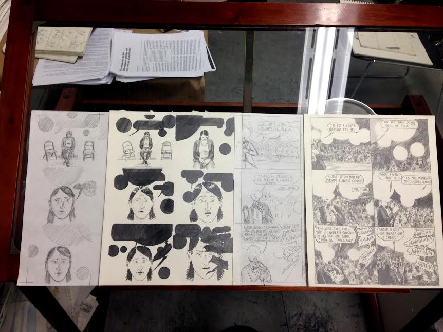
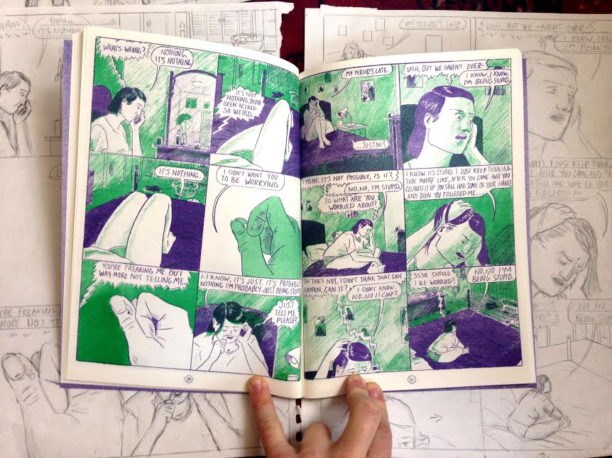
Here is a picture of what the roughs look like for the above planned pages. This is the stage where I actually tape paper up on my drawing table (see below), measure out panels and layout the final pages. These are scratch sheets that I lightbox to make the final drawings. This leaves me to be very free in the drawing and I often make little notes like an arrow (see bottom right of above image) to move an element around without having to redraw it. Sometimes like in the bottom left page above, I’ll leave a panel blank when I’m redrawing, or only slightly changing the image from another panel.
Part IV: Finishing

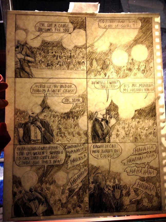
Here’s what the finished separations for the above pages look like.
Here’s my glass-top desk with clamp-lamps that I use to lightbox. Since the two color layers on this particular page are different overlapping images, there are two rough drawings and two final drawings as opposed to one rough drawing and two final drawings as with the color pages above.
This is what it looks like when I’m tracing the rough page to make the final drawing.
Part V: Photoshopping and Printed Pages
Here’s what the above page looked like when I Photoshopped the separations together. I knew I was going to invert (turn black to white and white to black) some of the panels in the green layer but it didn’t look right when I saw it how I originally planned it so I changed the top four panels so that they’d interact with the purple layer better. I tend to like working in meatspace with the drawings as much as possible and try to avoid computer work when possible but in the case of this page and a handful of others in the book, they needed a little cyber-finessing.

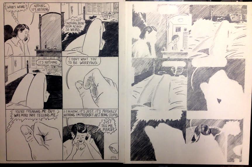
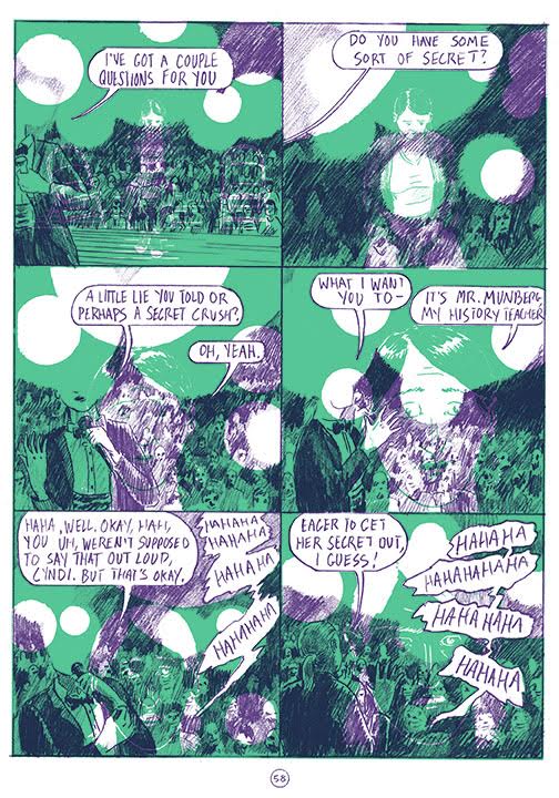
And here’s what those earlier pages look like in their printed form.
If you made it this far, thanks for reading! Feel free to message me (crepusculararchives.tumblr.com) if any of this is confusing or if you have further questions.
To acquire these books go here to Breakdown’s store,